Challenge the functional and synthetic mouthwash category with a new mouth care product.
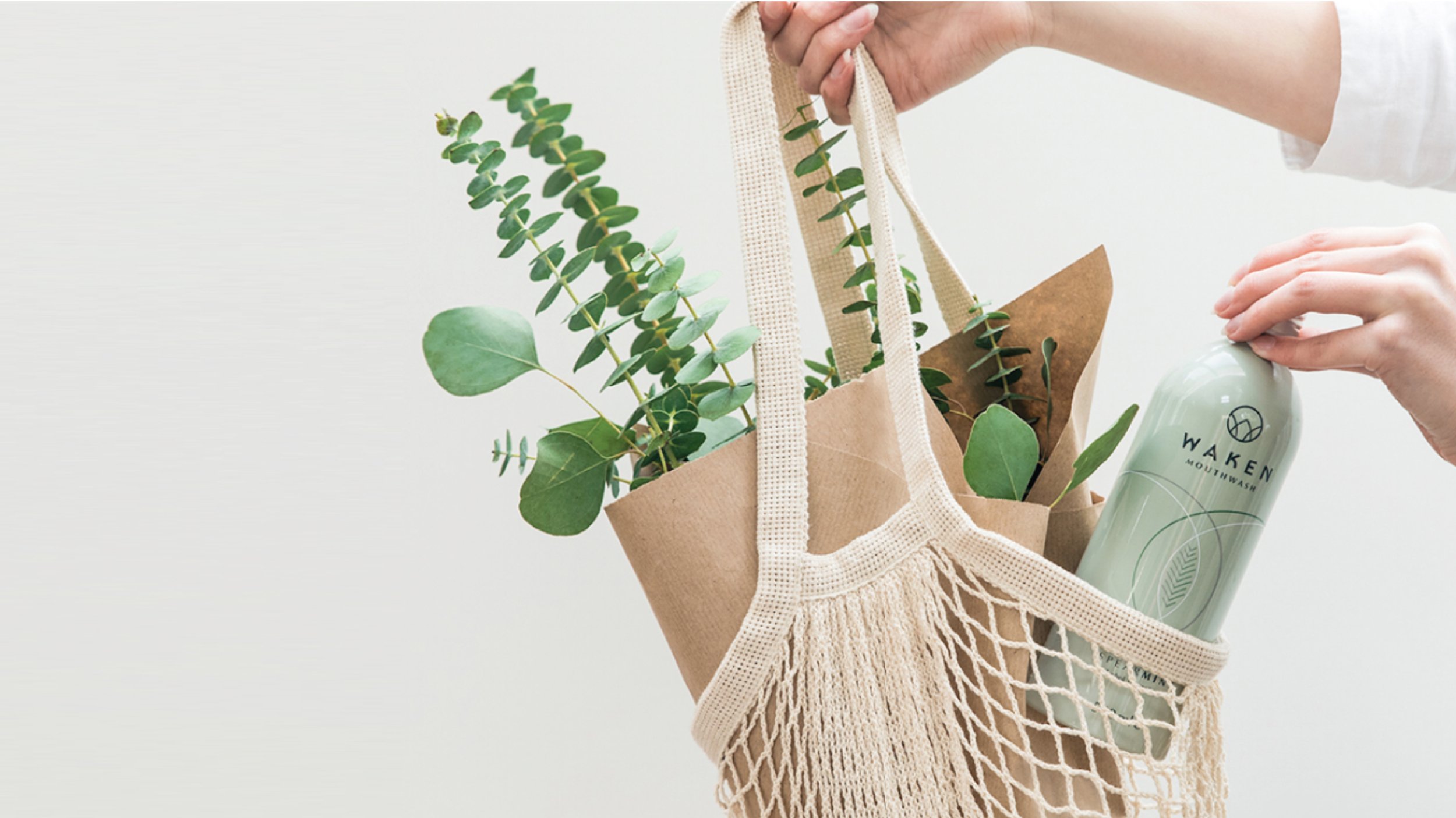
In an aisle packed with chemical solutions it was time for a breath of fresh air with a new brand that would see mouthwash liberated from the shadows of the bathroom cupboard and into a new space.
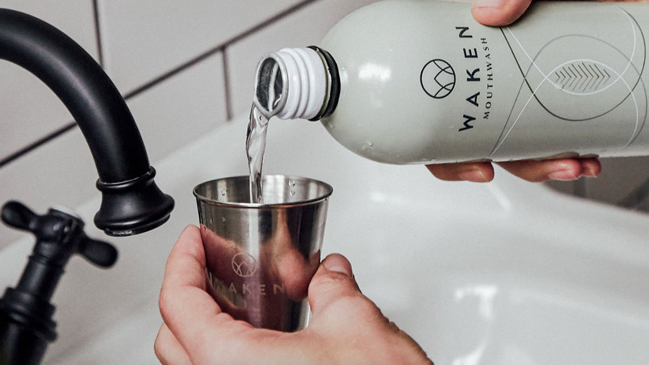
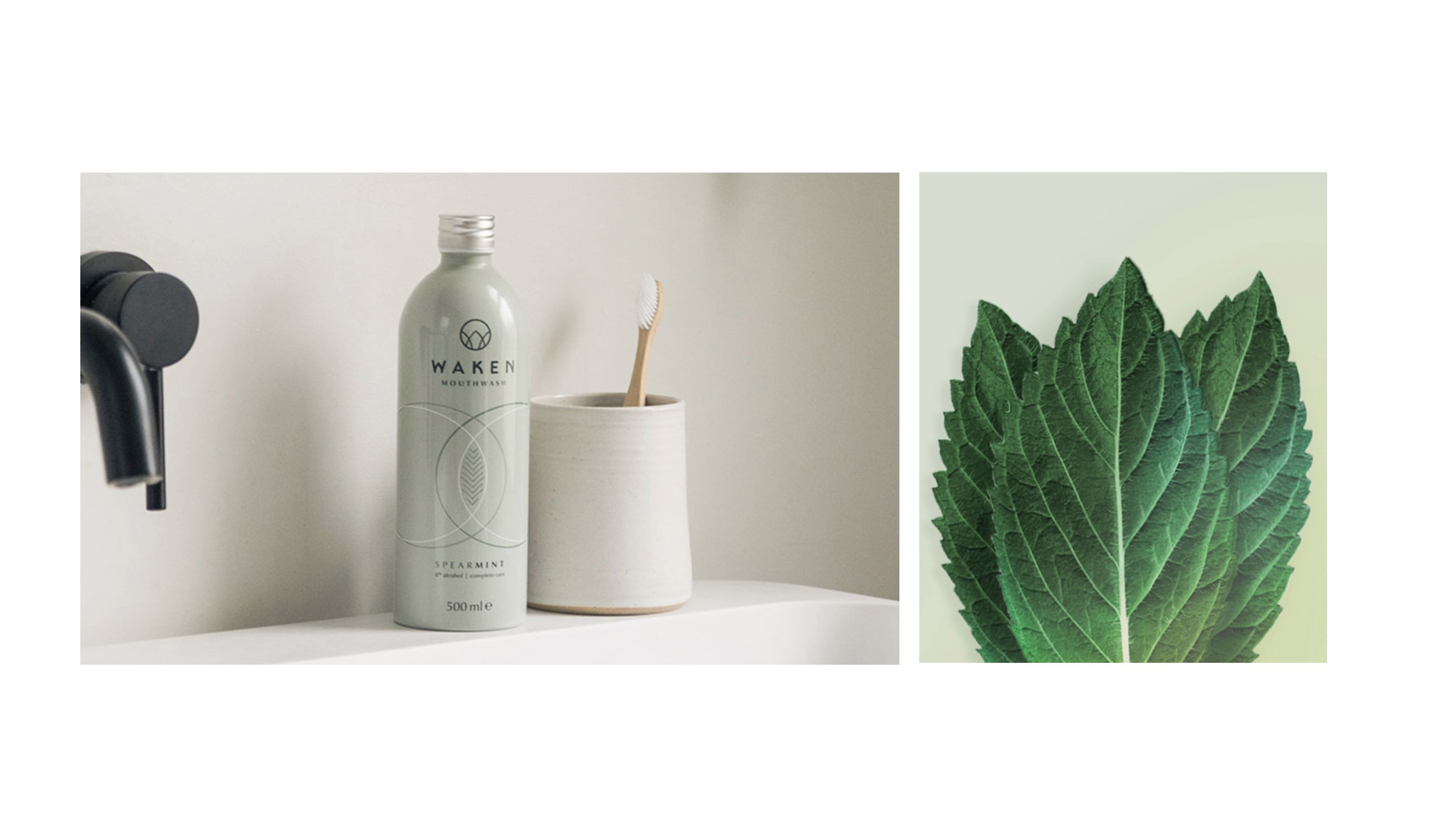
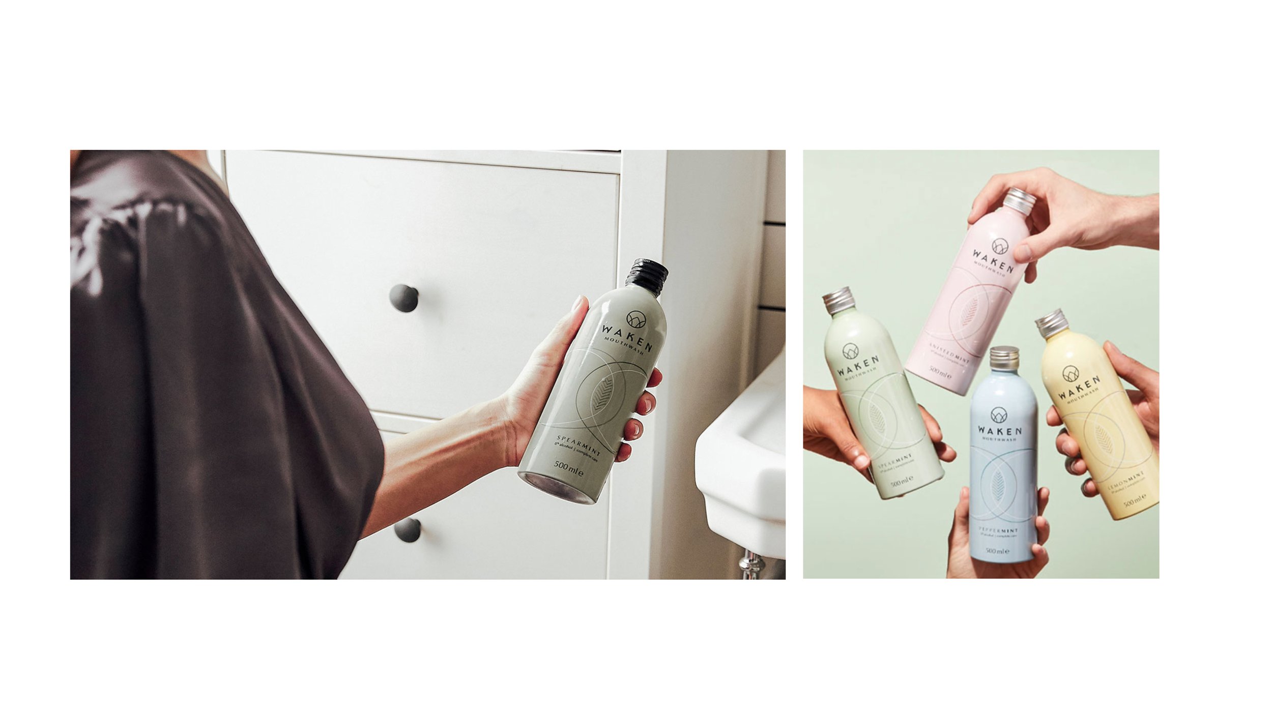
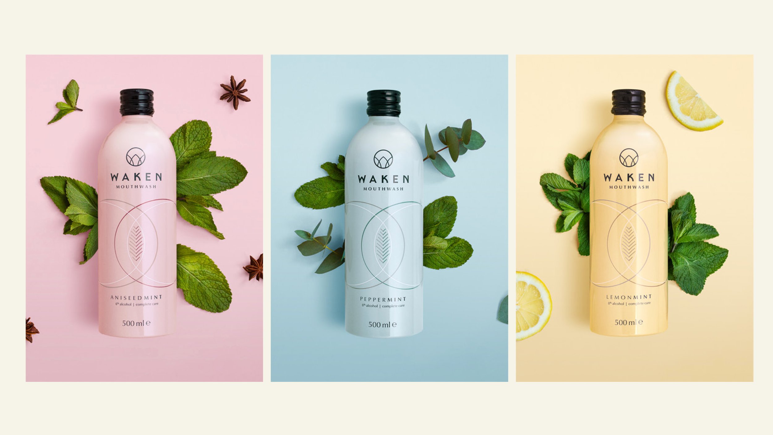
Our brand and packaging design of Waken include a soft, pastel color palette that takes cues from the products' natural ingredients – evoking a premium esthetic that breaks new ground in a highly functional mouthwash aisle. The shape of a mint leaf inspires the Waken logo – a key and essential ingredient across the brands' mouthwash range that embodies the potency and power found in mint. The Fibonacci spiral pattern found in nature inspires illustrations and visually represents the beauty in mint.
Work of Pearlfisher*